Why do you convert coloured images to black and white? What do you look for when aiming to produce a black and white image? For this post I'm going to cover what I learned from my mentor Ming Thein, about why we should choose one over the other and why some subjects work in colour but not in black and white and vice versa.
Whenever I go out shooting I would normally end up with both coloured and black and white images. I was asked, do I know why? I shoot digital and sometimes I use BW film. I do not shoot in BW mode using my digital camera. I always shoot in colour and I convert to black and white when it is contrasty enough or when it looks good in black and white, sort of a try and see process. Knowing what will produce a great BW image and what to look for is key because it will give you the best possible representation of the image and it can also save you time in your workflow, no more tinkering if it's best in BW or colour.
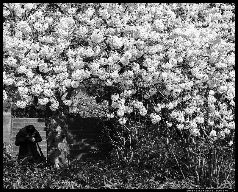
Situations with good contrast and good light will always produce images that work either way. So how do we know which will work best. There are obvious ones, for example, if the subject is colour. A red subject on a blue background or a bright blue subject on red background will make the subject pop and it's normally best to present these kind of images in colour. For a BW image to work we need to somehow see the world in monochromatic view. Ming told me to look for luminance contrast, not colour contrast. There should be enough luminance contrast between subjects and backgrounds for the subject to stand out. The best of the 5 images I submitted is the main photo above, Sakura and the Photographer. The photo will also work in colour but I decided to go with BW because of the luminance contrast between the blossoms and the shaded areas. It's not the best because of just the luminance contrast between objects in the image, it is the best because of the combination of balance, subject isolation and leading lines, a product of all my previous assignments with Ming. Of course for this assignment I had to demonstrate I understand it well by applying it on my images and also combining it with my learnings from previous assignments. The photographer for example will not stand out if the texture and colour of the background is dark. A dark subject on a dark background will not isolate him.

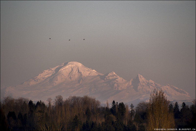
The two above I decided to present in colour. For the copper lamps it has to be in colour because the viewer would not get hints of the material if it was black and white. For the mountain, the viewer will not have any cues to the feel of the scene if it was monochrome. The pink glow is very atmospheric and the gradation between mountain slope and the sky helps to create more visual separation between land and sky and it will not be the case if it was black and white.
For this assignment Ming was kind enough to give me some reference article. He wrote it himself and you can find it on his blog, here is the link. I suggest you read it too, it's not too long and it helped me a lot specially the great example photographs that inspired me for this assignment. I had 2 favourites from that article, Prague Castle and the man behind the scenes. In the article he listed reasons and questions that should help in making the decision whether to go for colour or black and white.
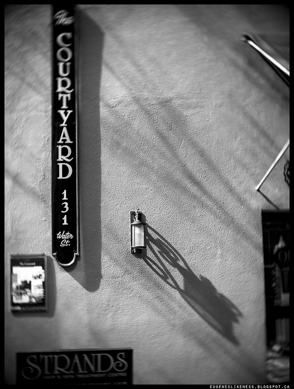
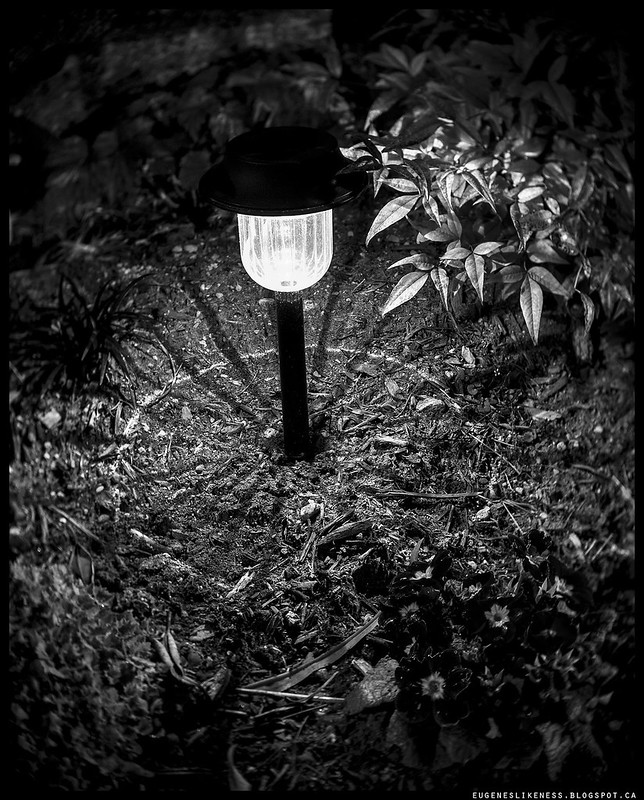
The last two images above were taken using a toy lens. I wanted to mention that because it has obvious blurring and swirling, an effect and characteristic of the lens. I decided to convert it to black and white because the fixtures on the wall isolates well with the plain wall texture and there's enough luminance contrast between the wall fixtures and the wall. The colours were not interesting enough for me to present it in colour. Same thing with the garden lamp. It was a bit boring in colour because it was an orange yellow glow. Except I could have dodged the background area of the head of the lamp to isolate it more.
I had fun doing this assignment I think because I simply love black and white. It was a challenge but with practice and determination I was able to achieve great results.
No comments:
Post a Comment